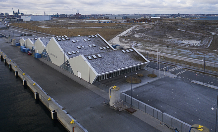
How much complexity?
The results of the Clever Classrooms study concluded that the effect of complexity is curvilinear, meaning that overly high or low levels of complexity produced poorer learning conditions, whereas an intermediate level of visual complexity was optimal.
The study’s findings concluded that:
- Visual diversity of floor layout and ceiling is enough to stimulate pupils’ attention, while presenting a degree of order. Higher, simpler ceiling forms can “decompress” the space, whereas more complex shapes can add to the complexity, as long as a feeling of clutter and disorder are avoided.
- Visual displays on walls should be well-designed and organised. It is recommended to keep 20-50% of wall space clear.
- Placing display materials on windows should be avoided if possible due to loss of light.
Are bright colours best?
Children are undoubtedly attracted to bright colours. However, a functional approach to colour in the classroom should focus on using colour to achieve positive outcomes such as increased attention span and lower levels of eye fatigue.
For example, Jalil et al (2012)³ reviewed how different colours influence work performance, cause certain behaviours, create negative or positive perceptions of surroundings and tasks, and influence moods and emotions. Their conclusion: that coloured environments have significant effects on students’ learning ability and their well-being.
They state that while colour preference is highly subjective, “red is the most preferred colour among young children and the elderly for an interior environment, while blue is the most preferred colour among young adults, office workers and male students”³.
For the Clever Classrooms study (2015)⁴, colour elements were assessed with low-brightness colours (white/pale) and high-brightness colours (red/orange). The stimulation from the use of colour was found to be curvilinear, i.e. optimally pitched at a mid-level.
Other findings concluded:
- For wall areas, the core aspect is curvilinear. Large, brightly coloured areas rated poorly, as did white walls with few colour elements. An intermediate scenario, with light walls in general plus a feature wall in a brighter colour, was found to be the most effective use for optimising learning.
- Against this relatively calm backdrop, additional colour elements played a complementary, stimulating role. As an example, relatively bright colours on the floor, blinds, desks and chairs add extra highlights and splashes of colour.
All in all, the conclusion is that classrooms should never be dull and boring, but careful attention to balance and a sense of order is needed to avoid over-stimulation.
Sources
- Godwin and Fisher: Visual Environment, Attention Allocation, and Learning in Young Children: When Too Much of a Good Thing May Be Bad. 2014
- Read et al: Impact of Space and Color in the Physical Environment on Preschool Children’s Cooperative Behavior, Environment and Behavior. 1999
- Jalil et al: Environmental Colour Impact upon Human Behaviour: A Review. 2012.
- Clever Classrooms (2015), Summary report of the HEAD project, University of Salford, Manchester